
What's the best color scheme for your interior?

When it comes to designing the interior of your home or office, the use of color can have a big impact on the overall look and feel of your space. By adding color in a smart way, you can create a more inviting and visually appealing atmosphere. The use of color in art can add depth, warmth and personality to your interior, making the space feel more like you.
As an artist, I love to experiment with combining different colors to create unique and visually appealing fiber art. I always try to find colors that complement each other well, as opposed to those that clash and don't work together. When it comes to interior design I recommend that you do the same thing.
Choosing colors for your interior can feel overwhelming at first, but it doesn't have to be. By considering the atmosphere you want to create, you can narrow down your options and choose colors that reflect your style, brand or personality. Warm colors like red, orange, and yellow can create a lively and energetic feel, while cool colors like blue, green, and purple can create a more calming and relaxing atmosphere.
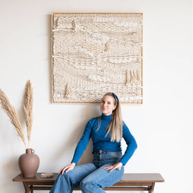
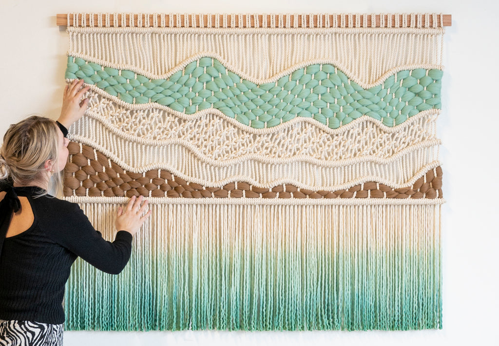
Neutral colors like beige, gray, and white can work well as a base for your room, but they can sometimes feel too bland on their own. That's where fiber art comes in. By adding a macrame wall hanging with pops of color, you can bring life to your room and make it feel more vibrant and dynamic. When choosing an artwork, it's important to consider the style of your space. If your interior has a more modern feel, then a contemporary wall hanging with bold colors and abstract shapes can work well. For a more traditional or classic look, an artwork with softer, muted colors may be a better fit.
Colors that fit your (brand) identity

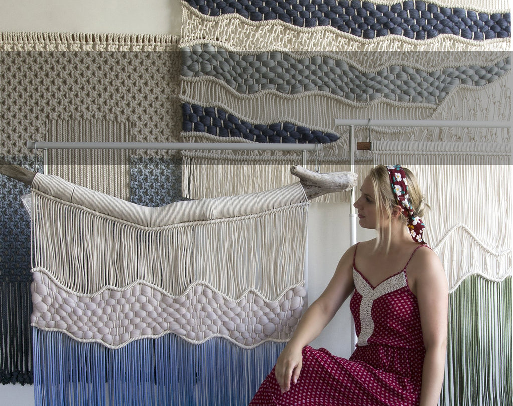
As an example, I recently had the opportunity to work with an interior designer to create custom wall hangings for a spa. The goal was to create a cohesive and meaningful art story that would tie in the branding color of the company while elevating the look and experience of the space.
I created one large feature piece for the lobby space, as well as six corresponding smaller pieces for the treatment rooms. Each piece was slightly different, but all incorporated the brand's signature color in a subtle and stylish way. The art not only added a pop of color and visual interest to the space, but it also reinforced the brand identity and created a memorable and immersive experience for spa guests. By selecting colors that reflect your brand or personality, you can create a space that feels both personalized and purposeful.

Don't be afraid to experiment (or ask for help!)
Ultimately, the use of color in interior design and specifically art can have a big impact on the overall look and feel of your home or business. By selecting colors and artwork that reflect your (brand) personality and style, you can create a space that feels uniquely you. So don't be afraid to experiment with color to make your home truly your own.
If you're looking for a (custom) piece or you need guidance in getting the right colors for your space, then please feel free to reach out using the contact page here and I'll do my best to help you out.
![]()
Rianne Aarts
Teddy and Wool